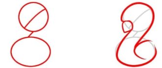
"Art is always modern." It is impossible not to agree with this statement of Fyodor Mikhailovich Dostoyevsky, the great Russian writer. Have you noticed how many new areas of creative activity have emerged in the last decade? One of them, literally, has made art speak. And no, it's not about the abstract idea that a picture sees in its admirer, but about the words. It turns out that you can not just write them, but paint them, turning them into colorful compositions that are eager to take their place on the walls of popular places, decorate the news feed and even become the poster of the event. The art of drawing letters - how do you like this kind of creativity?
We invite you to take a walk with us through the fascinating world of lettering. We assure you that you will enjoy it! But first let's look into the history of lettering and see how the style of lettering has changed since ancient times.
A brief history of the development of writing
As mankind evolved, there was a need to record words, and people began to figure out how to do it in a way that everyone could make out their message. At first there was "subject" writing - a writer transmitted his thoughts through the image of a concrete object, but not everyone understood the meaning, as there could be countless variants of interpretations of the image.
Later pictography replaced "object" writing: the representation of words in drawings. These are the same pictures of hunting scenes, battles which were drawn on rocks. An interesting fact: pictography is used even today: for example, the well-known image of a snake and a bowl of poison means a pharmacy. Have you seen it on pharmacy signs? Such messages are easy to read, but there is still the possibility that everyone will understand them in their own way.
Over time, it became clear that not all words can be represented by a picture. The drawings became more schematic and gradually developed into hieroglyphs. The most polar types of hieroglyphic writing appeared in China and Ancient Egypt. But even they did not solve the problem of interpreting what was written: every hieroglyph had many meanings and it was very difficult to remember them all.
The Chinese tried to solve this problem and designated a particular word with a combination of characters. Later, special signs - determinatives - were added, which allowed a more accurate reading of the message.
Over time, scholars agreed that it was necessary to convey not only the meaning of a word, but also its sound. So phonographic writing came to replace hieroglyphs, which used signs that conveyed the meaning of a word, syllables and "pointers" - indicating what class a word belonged to. This kind of writing was used in the Ancient East.
Then came the syllabic writing: the language of the ancient Sumerians was supplemented with hieroglyphs indicating syllables. And then a consonant-sounding writing appeared: special signs marked consonantal sounds only.
Aramaic writing appeared on the basis of the ancient Semitic writing systems and was taken over by the Arabs and the peoples they conquered. The Arabic alphabet was used by all who preached Islam, and only in 1929 some peoples changed it to the Latin alphabet [O. Voloshina, 2009].
It is noteworthy that the Arabic alphabet has 28 letters, each of which differs in its graphic figure. Arabic script has been widely used in art and creative writing. Calligraphy and different artistic forms of handwriting are one of the directions of the Arabic alphabet development. Various items, buildings, carpets and other attributes are decorated with Arabic inscriptions.
Nowadays the Arabic lettering style is used by decorators in different countries, including Russia. Have a look, How original the Russian font looks in the Arabian styleSuch variant of design can be used in lettering:
The ancient Greeks made a significant step in the development of writing: they marked with letters both vowels and consonants. Thus appeared the alphabet. Finally, the Latin script started to develop which provided the unity of the alphabets of different countries. Now the Latin alphabet is used by more than 30% of the world population [O. Voloshina, 2009].
In the 9th century the Slavic states began to form. The development of society and religion prompted the creation of the Slavic script. Cyril and Methodius created the Glagolitic alphabet, which had 38 letters and was quite difficult to use, but the Croats are still trying to use it nowadays.
Another writing system is called Cyrillic alphabet after its founder Cyril. It is based on the solemn, statutory letter, in which the liturgical books were written. It is worth mentioning that in contrast to Western Europe script was constantly improving. In 1708 Peter I issued a decree in which he defined the standards of book script [O. Voloshina, 2009].
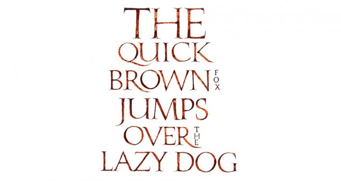
With the appearance of printing, the font started to change and a new type of handwriting appeared - fonts. They decorated various editions and were considered a decorative type of writing. Look, look at the original look of the lettering:
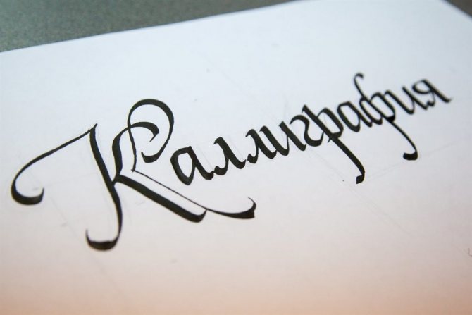
And this is what Lettering in the old Russian style:
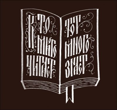
It's great, isn't it?
Who would have thought that in the modern world creative craftsmen would not only continue the trend of turning writing into art, but also give new life to the ancient styles of writing texts in such an original format [O. Voloshina, 2009].
Emil Ruder, a Swiss typographer and graphic designer, the author of the book Typography, conducted a large-scale study of fonts and revealed their correlation with different languages: the font directly depends on the native speaker of which language its creator is [E. Ruder, 1982]. It turns out that the aesthetics and beauty of letters depend, by and large, on the nationality of the author of the text. By the way, Ruder was one of the first who believed that design should not be limited to any style. This approach to creativity is exactly what lettering clearly displays.
What is lettering
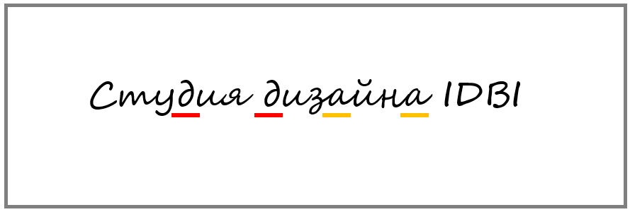
Lettering is called drawing of beautiful letters, and in this sense it can be compared to calligraphy. Indeed, in both cases, the goal is to get an original lettering that is distinctive and unique, reflecting a particular mood. However, the emphasis in lettering is still on drawing, it is closer to fine art than to writing.
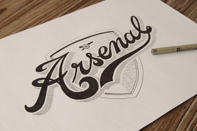
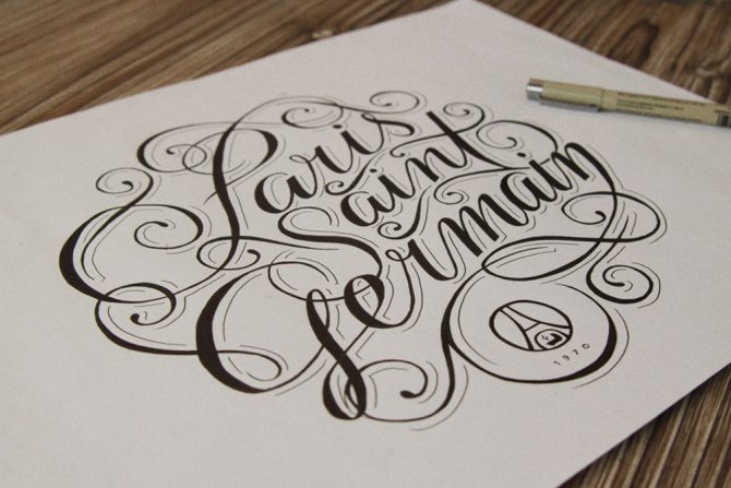
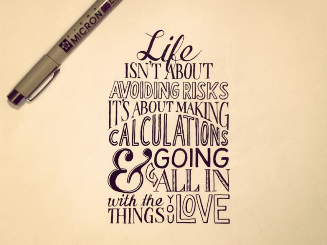
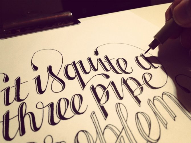
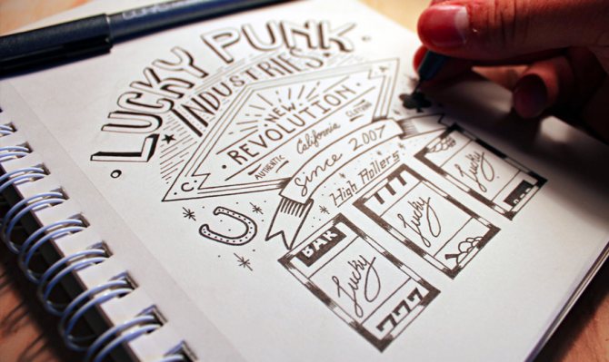
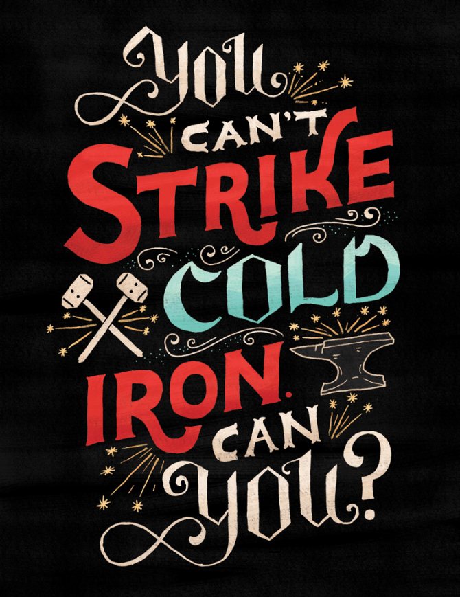
Author's works
For a long time "lettering" was just one of many creative trends. But in the XXI century it rapidly evolved into an independent, demanded and very well paid type of activity. And you can be sure that this trend will not go away overnight. As long as there is a need for the original performance of the text, there will be a need for letters, that is, specialists in lettering.
So what kind of art is this?
Lettering is a way of depicting letters as an overall composition. It is a flight of fancy, because there are no restrictions, the author can depict the letters as he wants, the main thing is that the overall picture is harmonious.
Despite the freedom of creativity, lettering is a system of different styles, figures, and is a logically assembled image. It is noteworthy that one can draw letters on absolutely any surfaces and with any materials: pens, pencils, chalk, brushes, etc.
Lettering is the creation of a unique lettering for a particular case or project. It is often confused with calligraphy, but there are certain signs that will help you understand once and for all, What the difference between these techniques is:
- In calligraphy, letters are written; in lettering, letters are drawn.
- Calligraphy is a rather restrained lettering technique. They are not complemented by anything; here we work only with the font. Lettering, on the contrary, uses all possible options to make the letters more interesting: bright backgrounds, curls, shapes, additional lines.
- The calligraphic text should be easy to read and be sustained in a single style. There are no restrictions in lettering, it combines the incompatible, and the final variant is not always possible to read from the first time.
- Calligraphy is most often used where it is necessary to write a large text: cards, letters, letters. Lettering is used in creative directions and adds originality and recognizability, for example, clothes or magazine covers [A. Chernaya, 2020].
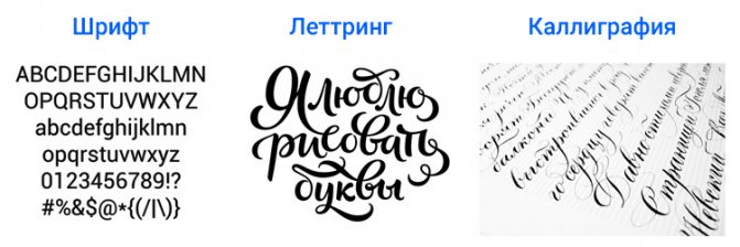
Below is a drawing that clearly demonstrates the difference between the two styles of depicting text. On the left is lettering, on the right - calligraphy:
Today letttering allows creative people to show their imagination to the fullest extent, to emphasize their individuality, to create something unique, which will then inspire other artists for their own creations.
When to use lettering
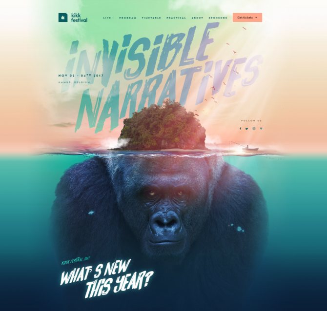
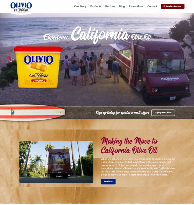
Lettering is not suitable for all web projects. Because the purpose of this direction - to carry an emotional message, to emphasize a phrase or image, not all brands will be able to use it for their purposes. If the main task of the site - to clearly present the information, to emphasize the seriousness of the resource, lettering will be "out of place. When using lettering in web design, you need to take into account some nuances.
Subject matter and the mood of the resource
Since lettering is a unique element in a particular style, it is necessary to use it to the point. There are a lot of styles and trends in lettering: from the Soviet style to vintage lettering. Therefore it is important to choose the right concept or to refuse lettering altogether. If you want to give the impression of a business brand, it is better not to use such techniques and prefer the classic style and direct typography. Lettering is usually used to create a cozy atmosphere (such as in the design of websites for coffee shops), lightness and beauty.
Color scheme.
Lettering is a full-fledged illustration and is embedded in the content. Therefore, it is necessary to think about the color scheme in which the picture will be created. This is the difference from handwritten fonts: It's not enough here to just choose one color for all the lettering. Lettering is often accompanied by additional decorative elements, for which you also need to carefully select the color shades.
The point
Since lettering puts emphasis on certain phrases, you have to think carefully about the meaning of the lettering in order to attract the client's attention. A bright inscription will be remembered by the user and become an element that will distinguish the resource from competitors' sites. Also, the text should be legible, so that the user does not have to decipher the inscription. For the inscription to be legible, the designer needs to adjust the kerning and the width of the letters.
Using lettering is not always necessary for the end goal. Sometimes it is worth sacrificing a trendy trend and using classic solutions. Usually lettering is used to animate a resource, because it seems that the lettering was written by an ordinary person, not a machine. If you need a business atmosphere, it is better to prefer more serious fonts and illustrations - square fonts, grotesque and so on. We wrote more about typography in the web in our blog.
Types of Lettering
"Freedom of speech" has helped develop several styles of lettering, each of which finds its own application in different areas. Let's take a look at The most popular of them all:
With a picture of the background: Lettering isn't just about interestingly drawn letters. You can use the space outside of the letters and depict a corresponding background. Such an image will be especially unique:


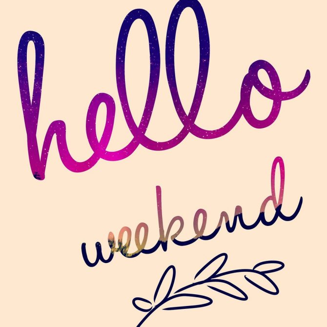
With an ombré effect: It is about the color of the letters themselves. A smooth transition of shades from one to another will add brightness to the overall picture:
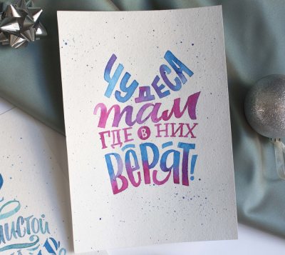

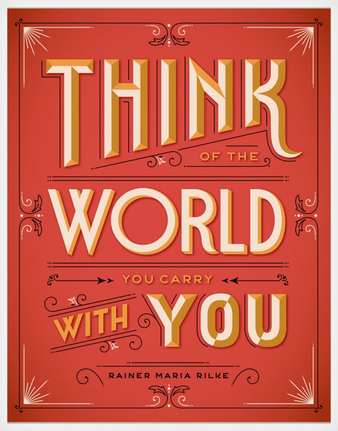
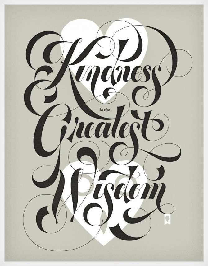
With the elaboration of details: The text can be supplemented with different elements, depending on the theme of the image. This can be geometric shapes, lines, curls and everything that logically fits into the overall composition:
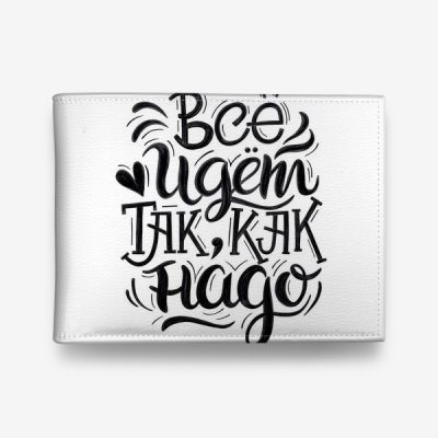

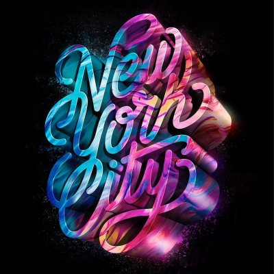
With a volumetric image: The 3D technique of drawing letters is quite capricious, because here you need to properly take into account the proportions, color combinations, image sizes, shadows. But if you master it, such lettering will definitely not leave anyone indifferent:


Vintage: Images in this style seem to come straight from 19th- and 20th-century America to the customer's table. The characteristic serifs, scrolls, certain colors and shades perfectly convey the character of those times and look appropriate in lettering:
Gothic: This style is actively used in depicting logos and in branding. There are more than 100 gothic fonts. View them here. And here's an example:
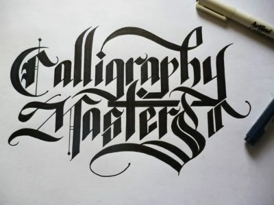

Graffiti: The wall art of street artists is always eye-catching, and if you transfer these drawings to paper, it's already lettering pure water:


In the form of a certain figure: The words can be enclosed in frames that represent the outline of an animal or any suitable object for the meaning of lettering:


A combination of different styles: There are no boundaries and conventions in lettering, unlike calligraphy, so several styles can be combined if together they are able to form a logically structured composition:


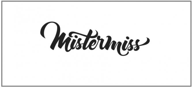
With the use of computer processing: and this is already one of the most modern styles of lettering, where handwritten lettering is translated into computer graphics or originally created in graphic editors:

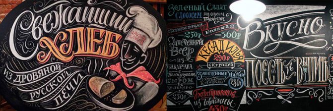
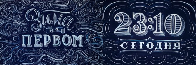
Chalk Lettering: Widely used in cafes and restaurants. The most ordinary chalk and chalkboard will be enough to create an original inscription about the action of the day or new delicious donuts, such an original announcement is sure to attract the attention of visitors:


There is another type of lettering, which is probably familiar to many and, moreover, was a companion of your daily life or the life of your parents. To him we have allocated a separate place.
Soviet lettering - a style that emerged from the American lettering. Artists of the USSR adapted it to the Cyrillic alphabet, and thus it acquired a special character and recognizability.
This direction of lettering does not lose its relevance to this day and inspires many creators to apply it to signs, famous clothing brands, because this handwriting is unique, unique and in an amazing way conveys the spirit of yesteryear.
According to contemporary designers, there are 3 main reasons for the emergence of Soviet lettering art:
- Revolutionary movements and the emergence of avant-garde artists: they supplanted the excessive tenderness, cute curls and other details of beauty from the images of the time. Society needed restrained colors, crisp lines and shapes.
- The Iron Curtain: Soviet artists and designers were very limited in professional information. While the fashion industry was in full swing in America, our craftsmen were developing interesting fonts on their own to decorate signs, broadcast headlines, newspapers, etc. This is what it means to be inspired by your own work!
- All-Union Standard 1337 "Gart Fonts: It was adopted by the All-Union Committee in 1930 and was considered mandatory. It included a limited set of fonts: 20 typefaces and 31 designs. This situation did not suit the Soviet design artists, they did not want to design all print products in one copy. They began to develop their own unique forms and styles of text, but they began to fix and publish them only in 1960, when the first font catalogs appeared [K. Golovchenko, 2014].
The Soviet font is connected with the history and culture of that time. Take a look at the familiar Soviet automobile industry lettering:


Or on The name of a public institution:


You'll probably remember the fonts the names of famous Soviet films:


We are sure that if you rummage through our grandparents' closets, or look closely at the names of old refrigerators and other household appliances, you can gather a whole library of Soviet fonts.
Of course, many signs and inscriptions, as a relic of the past, have long been modernized, replaced by more modern fonts, which fit seamlessly into today's style of city streets. But in some streets of St. Petersburg you can still see old well-maintained signs that are over 50 years old. Still, the culture of those times still lives among us [M. Levchenko, 2015].
Short quotations for lettering
Issue Title: Short Quotes for Lettering. Character is nothing but a long-term skill. Plutarch
I was born to make money dust...
The highest valor is to do in solitude what people dare to do only in the presence of many witnesses. François de Larochefoucauld
***
Be sure to get married. If you get a good wife, you'll be happy, and if you get a bad wife, you'll be a philosopher.
Good day! Oh, how empty and boring my life is without your presence. I want to be with you as soon as possible.
***
There's only one way to do great work - love it! Steve Jobs
The reading library in the city is an evergreen tree of devilish learning, and whoever constantly amuses himself with its leaves will reach the fruit. Richard Brinsley Sheridan.
***
Stronger than all victories is forgiveness. Friedrich Schiller
A friend in power is a lost friend. Adams.
***
Not sure - don't betray. Maxim Zvonarev.
Man has ceased to be the slave of man and has become the slave of the thing. Friedrich Engels.
***
Love is unjust, but justice alone is not enough. Albert Camus
Nothing but death can reconcile envy with virtue. Francis Bacon
***
When you feed the wretched, consider that you have fed yourself. Such is the nature of this deed: what we have given will be returned to us. John Chrysostom, Saint John Chrysostom
Remember the best dream and you will dream it! Sweet dreams, love you very much, kisses!
***
The greatest of all immorality is taking on a job you don't know how to do. Napoleon I Bonaparte.
The wrath of a lover is short-lived. Menander
***
A good actor can, it seems to me, perfectly play the silliest things and thereby increase their harmful effect. Leo Tolstoy.
Sleep, pretty boy, gentle as a teddy bear, kind as a little puppy, sleep, little one, sweet dreams and good night!
***
Every passion pushes for mistakes, but love pushes for the silliest ones. François de Larochefoucauld.
Not too good a character is he who is intolerant of the bad character of his neighbor: let us remember that both gold and bargaining chips are required in circulation. Jean Labruyere
***
Playing to a full and sympathetic audience is like singing in a room with good acoustics. Konstantin Sergeyevich Stanislavsky
A family is like a balloon - someone has to manage it, but not without ballast. A. Markov.
***
Love - the triumph of imagination over reason. Henry Mencken
All lovers vow to fulfill more than they can, and fail to even fulfill what is possible. William Shakespeare
***
Love is measured by suffering. G. Beecher
The fact that we are all constantly reaching for the luminous and the sublime does not prevent us from occasionally pulling away in a crude and primitive way.
***
Sex has become one of the most debated issues of our time. The Victorians pretended there was no sex; the present day pretends there is nothing but sex. Fulton Sheen.
The ability to courageously overcome oneself has always seemed to me to be one of the greatest achievements of which an intelligent man can be proud. Pierre Augustin Beaumarchais
***
Do not swear unnecessarily, but, having sworn and kissed the cross to your brethren, keep your oath firmly. Vladimir Monomakh
The greatest joy in a man's life is to be loved, but no less great is to love oneself. Gaius Pliny Cecilius Secundus (Pliny the Younger)
***
It doesn't matter what your friend's interests are, as long as you go crazy the same way.
How do you win a fight? Try to just walk away, because you never know how it will end. Evander Holyfield.
***
He who is a friend to any man is not a friend to me. Moliere.
A fool who knows his own folly is already wise, and a fool who thinks he is wise is, as they say, a fool.
***
The heart weeps without love, text me?
Knowledge is not enough, you must apply it. Desire is not enough, you must do. Bruce Lee.
***
Beauty is the quality by which a woman charms her lover and terrifies her husband. Ambrose Beers
It seemed to get out of the ass, it seemed to be just a dream...and it turned out to be the asses of the new season
***
A chihuahua dog runs a doohuahua in a day.
When friendship begins to weaken and cool, it always resorts to enhanced politeness. William Shakespeare
***
What an unclean silver lined earthen vessel, a fiery mouth and a wicked heart. Book of Solomon's Proverbs
How to find common ground? - Kiss!
***
Practice, gentlemen officers, he who clicks his heels more often in youth, crunches his knees less in old age!
Every long journey begins with a single, first step. Usain Bolt.
***
The greatest misfortune that befell man was the invention of the printing press. Benjamin Disraeli
Imagination rules the world. Napoleon I Bonaparte.
***
Intelligent men are intelligent enough to understand complicated things. Mikhail Afanasyevich Bulgakov.
You just have to look for a piece of happiness in every day, and then by the end of life you'll be able to put together a complete picture of it.
***
There is only one way to end evil - to do good to evil people. Leo Tolstoy
Women have only two weapons: mascara and tears. But we can't use them all at the same time.
***
May your mornings be good - pleasant and bright, and a little huge...
Everything wears out, even grief. Gustave Flaubert
***
Five words about the perfect man: The One Who's With Me Now.
Let us laugh without waiting a moment to feel happy, otherwise we risk dying without ever laughing. Jean Labruyère
***
Human virtues, like fruits, have their season. François de Larochefoucauld
You, my love, have only to wake up to enjoy the morning before you have to run to work.
***
We live in this world if we love it. Rabindranath Tagore
The words of the wise are like needles and like driven nails. The Book of Ecclesiastes.
***
Know the character of a friend, lest you hate him. Quintus Horatius Flaccus.
Beginning with this wondrous morning, may you succeed in making all your plans come true.
***
People would flee from one another if they saw one another in utter frankness. Immanuel Kant
If one does not suffer, does that mean one enjoys the highest good? Marcus Tullius Cicero
***
There is no word for too much in the dictionary of love. Luciano De Crescenzo
Democracy is an abuse of statistics. Jorge Luis Borges
***
This sun shines warmly for you, the wind rubs your curls lovingly.
You're the one I wouldn't mind going crazy with...
***
Kindness in a woman, not seductive looks will win my love. William Shakespeare
There should be no limits for us. Richard Bach
***
We all look to Napoleons. Alexander Sergeyevich Pushkin
Thrift is an important source of prosperity. Marcus Tullius Cicero
***
Only mediocrity is always in uniform. Somerset Maugham
He who casts a net, is caught in it; he who digs a pit, will himself fall into it; he who sharpens the sword, will himself perish by the sword.
***
Betrayal of friends - it's painful and unpleasant, but allows you to better understand people.
There is much bread in the field of the poor, but some perish from disorder. The Book of Solomon's Proverbs
***
If you want to know how old a woman is, ask her mother-in-law. Or daughter-in-law. Edgar Howe.
Short Quotes for Lettering - Labor is often the father of pleasure. Voltaire
Happiness cannot be bought, happiness can be born!
Where is lettering used?
The variety of styles and forms of lettering allows it to be used in different and sometimes unexpected areas. This type of art is widely used in marketing, namely, in creating logos, packages, labels, and its main task is to attract the attention of consumers by unique design.
Now it has become fashionable to depict bright inscriptions on clothing and accessories. Such prints appeal to those who want to stand out. Lettering is used in printed materials, they often decorate postcards, magazine covers and notebooks.
Originally drawn letters on the walls have become an attribute of public institutions and are already firmly included in the design of interiors. And photo-zones with individual inscriptions on the banner can great decorate any event.
Now it is also fashionable to brand social media pages with lettering. And those who are braver, can decorate with it not only a personal page in Instagram, but also their bodies, having beaten up an interesting tattoo in the style of lettering.
As you can see, the application of this modern type of creativity has almost no limits. More precisely, these boundaries are set by the artists themselves, again and again creating unique images that are just begging to take their place.
Examples of Lettering
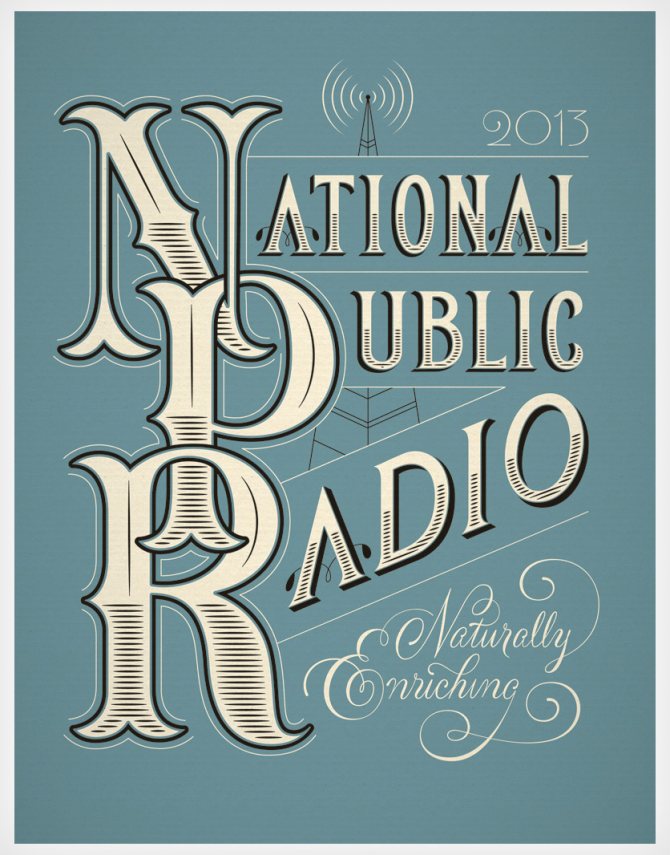
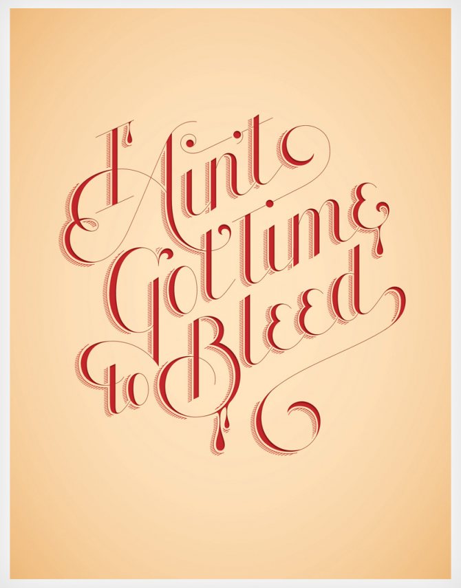
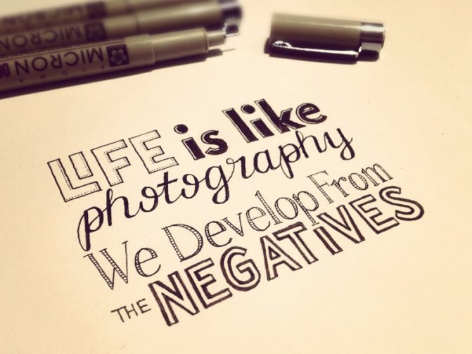
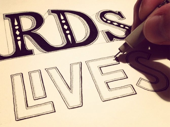
Here are a few more examples of Lettering that will help you understand the differences between the different directions of this art and develop your own irresistible style.
Alexis Taïeb
Jessica Hische
Sam Bevington
Young Jerks


Tanamachi Studio
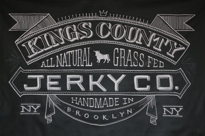

Sean McCabe - Seanwes
Ginger Monkey & Ged Palmer
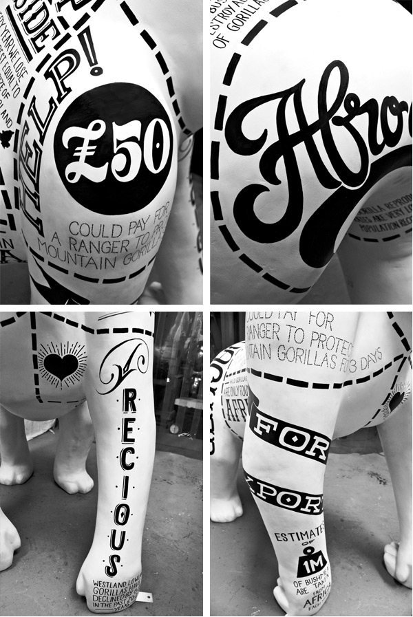

Jason Carne
Mary Kate McDevitt
Claire Coullon
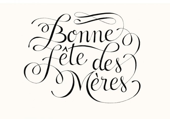

Friends Of Type


How do you learn lettering?
Are you inspired and determined to learn lettering? Then we advise you to start your creative journey with the purchase of a stationery kit. To get started you will need:
- A high-fastness lead pencil. A 2B or HB will work.
- An eraser that gently erases the pencil without smearing it on the paper.
- A highlighter with a soft brush.
- Drawing paper or, better yet, a sketchbook, so you don't lose your sketches.
- Colored pencils, pens, felt-tip pens. They will be needed for the final filling of the drawing with color.
You can draw letters on any surfaces and with different tools, but it is better to use the simplest tools, as lettering starts with studying fonts, letter shapes and drawing techniques.
Illustration artists advise practicing lettering in writing. We recommend reading the lettering book "Letter to Letter" by Tatiana Chuluskina, illustrator and art director. It contains useful information for beginning letterers, which you can put into practice right away in the pages of this book.
There are several classes of fonts in lettering that must be mastered first. These include:
- Antiqua: A serif typeface in which the vertical stroke is thicker than the horizontal stroke.
- Contrast .: characterized by a large difference between the thickness of the main stroke and the supplementary stroke.
- Grotesque: The opposite of antiqua, has no serifs, all strokes are perfect in thickness.
- Script: This typeface is also called handwritten, it resembles calligraphy.
The letters themselves are a system of various elements whose names need to be memorized.
A letter can consist of:
- base strokes and connective strokes;
- the nappings;
- the intra-letter space;
- end element;
- bottom outline element;
- double-sided serif;
- drop.
An illustration from the book "Letter to Letter" perfectly demonstrates the structure of a letter. Save it so that you always have it handy:


It's best to start practicing lettering by drawing the alphabet, so you begin to get a feel for the shapes and features of each letter. Write the phrase, "Have some more of those soft French rolls, and have some tea!" This phrase uses all the letters of the alphabet.
The main principle of depicting letters is to go from the general to the particular. To begin, mark the dimensions of the letter, mark the main and connecting strokes, draw the inner and outer ovals, if any, and complete your schematic image with details:


Do not try to write perfectly flat; the beauty of lettering is that it does not require correct shapes, but rather is characterized by dynamism and creative carelessness [T. Chuluskina, 2018].
If you have difficulty learning on your own, don't be upset. There is a lot of useful information and free video tutorials on the Internet. Watch, for example, this video, and don't forget to prepare to watch your kit of a beginner letterer, because in lettering, especially for beginners, the most important thing is practice:
You can also take a class at an online lettering school, choosing the right direction for you. Here are some useful links:
- Lettering-school: The first online lettering school in Russia, created by Anna Rolskaya, a practicing letterer from Portugal. Here you will find many courses and master classes that are sure to please you.
- School of Veronica Kalacheva: Another worthy training option from representatives of Russian lettering. On the site you'll find a course from letterer Tatyana Chuluskina, author of the book "Letter to Letter". By the way, there is an opportunity to take a free introductory lesson.
- Artist Online: The academic program at this school is based on practical tools from the nation's top universities. Here you will find courses at an attractive price, as well as a lot of useful free information.
To become a good letterer, you need to have not only the desire, but also creative thinking, a sense of style and harmony. We recommend that you check out our online program "TRIZ in Practice", where you can assess your creativity and learn how to approach problems in an unconventional way, even in the field of art.
What tools are needed
The choice of tools and materials depends largely on what your goals are. For example, for drawing letters for personal needs (for making a postcard for friends, for example) it doesn't make sense to spend money on expensive professional tools. And if you plan to create high-quality projects for commercial purposes, of course, you need to invest in better materials.
On the other hand, if you at least once try to draw with quality pencils or brushes, you will immediately feel the difference. Working with good materials is much more pleasant and comfortable, and the result is immediately much better.


Author's work
A minimum kit you need to start drawing for yourself:
- A soft simple pencil. It's better to use 2B, but if you like to pressurize it, you can use HB or B (bold lines are harder to erase, they leave a mark on paper.
- Eraser. It should be soft so it removes a pencil well and doesn't smudge it.
- Paper - you can take regular office paper for drawing or buy a sketchbook.
- Colored markers, pencils or pens. Needed to trace outlines and paint over.
A professional kit comes in handy for those who want to create competitive designs or draw letters at a high level. It includes:
- A soft pencil. Again, those who do not like to press hard will do 2B, but if you draw with pressure, it is better to take a harder one.
- Eraser. It is important that it be very soft and leave no marks. Many illustrators use an eraser-blot, which does not scratch the paper, and the resulting work looks neat and presentable.
- Rulers. Needed to trace outlines. For fans of thick lines suit 0.8, 1.0 and 1.2, thinner rulers are marked 0.2, 0.3, 0.5. There are no universal recommendations for liners: choose the one that you feel comfortable working with.
- Brushpen with two tips. This is a tool with a marker on one end and a brush on the other. You can use the marker to outline or paint over letters, and the second tip is perfect for people who are mastering brush-lettering, that is drawing letters with a brush.
- Brushpen with a single brush tip. This tool is more difficult to learn than the previous one, it is more difficult to control the writing, it requires more skill and therefore is not suitable for beginners. However, it is what you need if you want to create fancy letters today that have very thick and thin lines.
- Paper. Its density should be at least 80 g/m², that is, the usual office sheets for the printer will do.
This list of tools is not universal. Each letterer with time understands what he is more convenient to work with, and collects his own set of favorite tools. However, it's best to use this list to get started.
Tips from a pro
Jessica Hish is a young illustrator and letterer, and her résumé is adorned with the facts of collaborations with such famous companies as The New York Times, Starbucks, Nike and others.
Her book "Pro Lettering" about the technical subtleties of lettering, filled with step-by-step tips and illustrations, has won the hearts of many artists, because it contains a lot of useful information both for those who are used to drawing with a simple pencil and for those who work with vector graphics.
Here are some tips Jessica Hish gives to those who are into lettering:
- If you decide to become a letterer, learn to appreciate the little things.
- Put content first. Determine what the purpose of your work is. It must be based on research, you can't skip this step.
- Lettering is a drawing, and calligraphy is writing, not everyone remembers that. Typographic design is a system based on the letter form. A drawn typeface is a work of art.
- Use kerning as little as possible. This keeps you safe from other people's mistakes in case someone who opens your work on a computer has your Illustrator settings messed up.
- Otherwise you will appear in your customers' nightmares.
- If you are working with letters and adding strokes, make them easier than the letters themselves.
- You can silkscreen almost anything and it will look good. Printing forgives a lot. Terrific paper and color will make the worst designer a professional.
- If you're a letterer for a small company, you have to be flexible as a professional. If you're a freelancer, you need to have a specific specialty so people know why they're coming to you.
- If you need to show exactly what the problem with the logo is, make the "before" and "after" versions so that even a non-visual can see the difference.
- You don't always have to blame the client. If something goes wrong, you may be asking him the wrong questions.
- Every step you take should be described to the client in detail in writing. He should understand what you did and why.
- Very contrasting thin and thick lines don't work [T. Banks, 2015].
You can see Jessica Hish's work and be inspired to create your own masterpieces here.
The nuances of using lettering in web design
If a designer wants to use lettering when designing a website, he will inevitably encounter difficulties.
The first of these is adaptability. To display the layout correctly on other devices (cell phones, tablets, etc.), you need to develop a design for different screen resolutions. In the case of lettering, it is not easy to change its characteristics: it is necessary to change the scale without loss of quality and legibility of the inscription. Therefore, you need to take into account these nuances in the development of multiple layouts. This nuance was taken into account on the site of The Girl and the bull:


The next difficulty is the choice of technical implementation. There are several ways to add lettering to the design of the site:
- as a bitmap image;
- as an SVG format;
- As a web font.
Each of the ways has its own advantages and disadvantages. For example, bitmap images are easy to implement, but they lose quality when scaled and are not read by search engines. SVG is a vector graphic, you can learn more about the format here. As for web fonts, they are created separately and are difficult to implement. However, this approach will allow designers to create their own font based on lettering and then use it on other pages of the project.
To sum it up
Lettering is a flight of fancy, freedom for creative artists, a way of expressing their emotions, the result of versatile thinking of the artist, a victory over the outdated conventions about how a store sign or a magazine cover should look like.
This type of art can become not only a fascinating leisure activity, but also a profitable business. Now it is very fashionable to apply lettering in different spheres of activity, because it is a great way to draw attention to a product or an institution.
And if you haven't yet been inspired to stroke the snow-white paper with a pencil, then check out the page of popular letterers, such as Lisa Quinne, Jimbo Bernaus, or the general account, where the best works of Russian contemporary art creators are collected.
If you love to draw or want to learn, do not deny yourself the pleasure of plunging into the creative world of lettering. We wish you inspiration, ideas, and a pleasant pastime for this fascinating activity!
Good luck!
We also recommend reading:
- Storytelling
- Tips for improving nonfiction writing
- Writing practices: how to write to make life easier
- A Time Capsule to Yourself
- Calligraphy: The Art in Every Letter
- Exercises that will awaken your creativity
- Storytelling as a tool for success
- 8 reasons to practice creative writing
- 20 curious facts about the Russian language
- Lettering: art in letters
- How to improve your writing skills
Keywords:1LLL
How to make money from lettering
The success of lettering is determined by the commercial benefits it brings. Oddly enough, beauty is not the main thing for successful sales. It is necessary that the work be in demand, and for this it is important to create trendy things in the first place.
The main principles of successful lettering are:
- conciseness of composition;
- minimalism;
- Following trends.
If the first two are developed with experience, the second is the result of close study of the market, works of popular letterers, as well as analysis of sold and demanded compositions.
For successful sales it is very important to know at least some of the principles of this market. Many letterers have succeeded simply because their first specialty was in economics, advertising, or sales. Using their knowledge, they were able to make the right claims and attract customers.
Works by the author
You can sell your work in two fundamentally different ways:
- Through social networks or one's own site;
- Microstocks - platforms where anyone can post their creative work for sale.
Each of them has advantages and disadvantages. Consider them in detail.
How to sell your work via social networks or your own site
This option requires active promotion.
- Determine your target audience. To do this, establish the area in which you will create: for example, creating lettering for T-shirts and greeting cards or work on brand logos.
- Create a unique selling proposition-something that will set you apart from the competition.
- Work on your image. Collaborate with other bloggers, participate in themed events or start a workshop.
- Create a portfolio and add to it regularly. Potential clients need to know what you can do.
Benefits
- You work directly with clients, and this is convenient: you do not need to anticipate the desires of an abstract potential customer, your customer will tell you exactly what he wants.
- Properly configured advertising in social networks can bring you wide popularity, especially if you place it in popular blogs and correctly identify your target audience.
Disadvantages
- Promoting a blog in social networks requires active participation and material investments, it is not a passive income.
- Almost always success depends on the external attractiveness of the blog, your activity and advertising - without this you can not attract a customer.
How to sell through microstocks
Microstocks are universal bases for selling the products of your creativity, since both well-known artists and novice letterers are represented on them. These sites do not impose high requirements to the level of performance, so even beginners can successfully make money on their compositions.
- Register on one or several sites (Shutterstock, Adobe Stock, Depositphotos, etc.), read the rules of posting (resolution, quality, profile requirements).
- Upload your work and wait for buyers.
Advantages of
- It is a relatively passive income: you can sell each work as many times as people want to buy it, so theoretically the income from it is unlimited.
- Microstocks do not require your constant presence, advertising, etc.
- This type of business dispenses with the material investment.
Disadvantages .
- The first time profit grows very slowly.
- Microstocks are highly competitive, so you need to constantly improve and follow trends.
- The work involves a flexible schedule, which means that you will need good self-management. It is necessary to regularly add to your portfolio, learn new directions, and develop your own style that will attract customers.
Ideally, it's a good idea to combine both methods of monetization: their advantages and disadvantages cancel each other out and allow you to establish stable, regular sales. By concentrating on one thing, you're missing out on opportunities that the other option offers.
In any case, be prepared for the fact that there will be no instant results. Perhaps the first months of profit from microstocks will be minimal, and social networks will require investment in promotion. Have patience. When it all works, you will see how profitable it is.
Some tips for beginners
In any creative business, the main thing - the right attitude and good materials to create a masterpiece. Of course if you are new to lettering you can do with a pencil and eraser, but we strongly recommend that you use quality tools. Believe me, the difference will be palpable, and you will get even more pleasure from the process.
What you need to get started:
- A 2B or HB soft pencil, if you are used to pressing down on it;
- felt-tip pens, colored pencils, and pens;
- a soft eraser that erases the pencil well;
- drawing or drawing paper.
As you can see, the list is not long, and you will probably already have some of these things. If you get into taste and want to do it professionally, the list of stationery will add such tools as rulers for outlining and brushpen - a marker with a tip-brush or two tips (brush and marker). Each master collects his individual set of creative tools, depending on the chosen direction and style.
Now that you have decided on the tools, it remains to understand where to start. Here are some tips:
- You can watch a few training videos, there are a lot of them on the Internet now. Pay attention, for example, to this video tutorial:
The main thing is practice, so feel free to repeat after the author.
- Find inspiration in ready-made lettering, examine it carefully, and try to reproduce it. This will help you get your hand and develop your taste. Just look at the work of famous letterers Stephan Koontz and Lauren Hom.
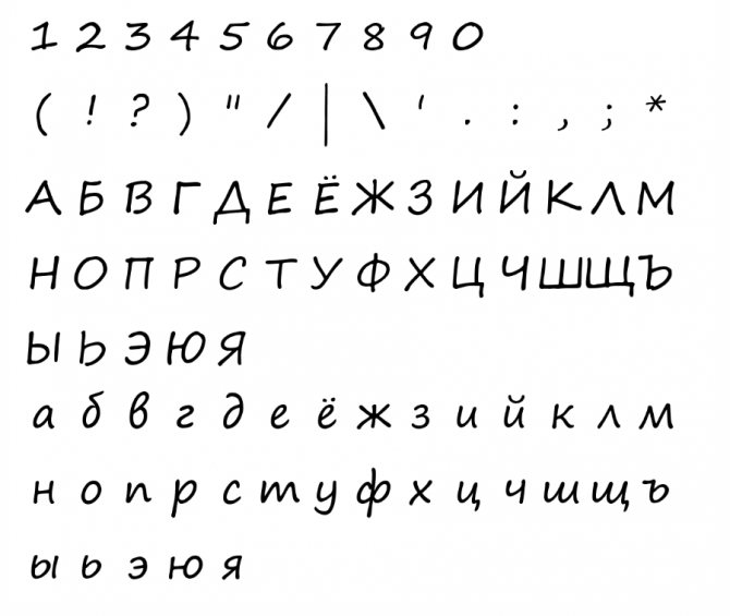
- Practice lettering, but not the tried-and-true ones you know from school, but the ones designed specifically for lettering. You can find it on the Internet.
- Take time every day to practice, and remember that it's better to draw for 15-20 minutes every day than once a week for 1-2 hours.
- If you enjoy doing this kind of creativity, sign up for online courses. On them you will learn a lot of interesting techniques and get valuable tips from the outside.
Lettering is a field that does not require an art education; minimal skills and a love of creativity will suffice. Of course, if you have a good sense of style, developed imagination, and know how to combine colors, you will achieve success in lettering faster.
And to develop your creative thinking, we advise you to take our online program "TRIZ in practice", where in a few weeks you will learn how to apply various algorithms to solve non-standard problems in different areas of life, including art.


